not quite crafty...
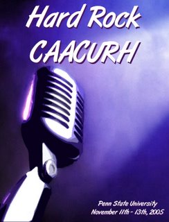
...but here's a little graphic design that I've done.
It's a conference bid (very exciting, I know), for a regional student government leadership conference held every year. Through the bidding process, different colleges and universities in the conference compete to hold the conference at their school.
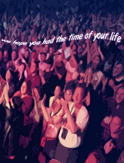
Basically, I took information from all of our gazillion chairs, put it together in a cohesive form, and made it look professional. It was a *huge* job. Every graphic in the bid (excluding trademarked items and an obvious clipart or two) was created individually by yours truly, working from images of famous musicians.
Another university -- who shall remain nameless -- dropped out of the process because they were so intimidated by our bid. :-D I'll admit it, that gives me the warm and fuzzies. I put blood, sweat, tears, and more hours than I care to mention into this bid, and I love that it made another university shake in its boots. needless to say, we got the conference for this year (it starts Friday -- eep!).
I don't expect you to last through all 66 pages of it, so here's some images I created for the front and back of the conference binder.


Maybe if I was smart, I would have gone into graphic design. Oh, well :)
EDIT: I finally figured out how to recover this post! I was too lazy to re-write it. :-P


2 comments:
The bid looks awesome!!! One worry I have though (because I don't want you to get into trouble, I like you too much ^_~) is the use of the Hard Rock logo, even in its modified state. Did you get permission to use it? I love how everything looks though, and congrats on getting the conference! And good luck getting ready for it!
*chuckles* I was wondering what had happened to it ^_^
Glad it all worked out well!
Post a Comment