Anyone who has ever lived in the 10 X 12' cinderblock cell that is a college dorm room knows that decorating can be a serious challenge. After spending three years compromising, I *finally* have a room of my own. All my hard work in student government has afforded me a two-bedroom, one-bath suite that I share with one roomate.
I spent the summer working on a plan to make my collegiate prison into something home-y, yet practical and storage-friendly, and I think I've accomplished my goal.
First, here's the BEFORE:

Bed.

Closet.
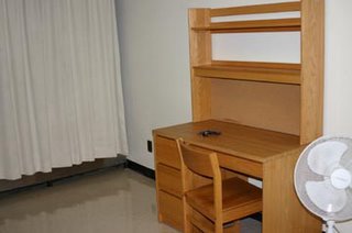
And desk. A little spartan, don't you think?
And now...
AFTER: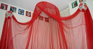
This red canopy is my favorite part of the room -- thank you Ebay! It's dramatic, and just a touch trashy, which is why I love it. The lanterns at the tiebacks were purchased on clearance ($1.95 ea) from Crate and Barrel online. The square pictures on the very top of the wall are from the book 'I Feel A Sin Coming On' by Anne Taintor. They form a border all around the room.
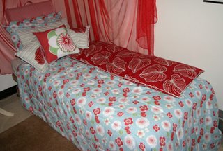
The entire 'bedroom' design was worked around the comforter set, which I got on super clearance (less than $8, not including shipping) from UrbanOutfitters.com. It included the comforter, the two shams, a flat sheet, a fitted sheet, and the throw pillow in the middle. Using the flat sheet and some fabric that I got on sale at IKEA ($5.99/yd), I made the two other throw pillows and the body pillow cover. The square cushion in the back is made of some red striped cotton bottomweight that I got at Jo-Ann's. You can *never* have too many pillows...
Under the bed are Tupperware containers that hold all my extra purses, scarves, gloves, mittens, hats, etc.
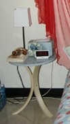

The endtable was purchased on sale from IKEA ($11.95) and matches perfectly. The Japanese Government Railways poster was an afterthought purchased at PSU's annual poster sale. I didn't think I'd be able to find anything to match my wierd colors (sky blue and red?), but this fits perfectly.
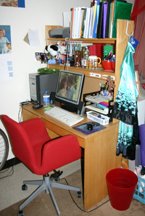
My 'office' area. By changing the alignment of the desk unit, I created a makeshift wall that separates my room into a 'bedroom' area and a work space. The chair was the most expensive part of the room, but I think it was well worth it. IKEA once again.
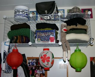
I don't remember who I stole this idea from, but these are just wire crates ($9.99 for about a gazillion at Target) attached to picture molding with hooks. I wouldn't fill them with anything super heavy, but they're just perfect to hold my sweaters. The lantern in the middle is also from Crate and Barrel, and the two on the sides were purchased at an end-of-summer sale at Joann's.
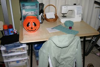
This is where the magic happens...my sewing table. This aspen and metal table and four chairs were a steal at IKEA ($79.99). I bought them last year, and they're still the best investment I've made. I've got a huge Tupperware storage container filled with fabric underneath, a little organizer on top for notions, and a larger organizer to the side for miscellaneous stuff.
The curtains are hideous, I know, but apparently they're flame retardant and Penn State says I can't change them. Grr...
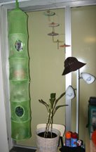
This wall drives me crazy...olive is just too gross for words in here. Unfortunately, I can't do much about it. Have you looked for contact paper recently? I couldn't find a single better alternative. The hanging organizer (IKEA, $4.95) holds all my yarn and needles. The triple arm light helps a bit with the dismal lighting. Excuse the very sad plant. I don't think I spend enough time in my room to warrant having something living in here.
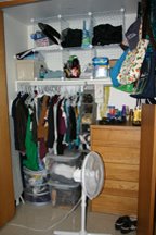
And last but not least....my organized-within-an-inch-of-it's-life closet. Can you tell that storage is an issue here? Everything possible is hung up, drawers are filled to capacity, and I *still* can't find anything to wear on a Friday night. :-P The top Tupperware container holds more fabric, and the bottom one is
full. of. shoes. I love being a girl. :) Miscellaneous junk is kept in the wire organizer up top. All in all, a very efficient (though not terribly pretty) use of space.
...and that's the grand tour. What do you think? Leave a comment and make my day. :)
Bless this mess! :-D


2 comments:
Wow, you did an awesome job making the most out of the tiny space available to you. Well done! And I actually like the look, too, seems to be very much you ^_~. Kudos m'lady ^_~
What can I say. Edgier than Martha Stewart, more functional than so many designers. It seems a shame that you'll have to take it down at the end of the year.
Good job.
Post a Comment